- Thread Starter
- #1
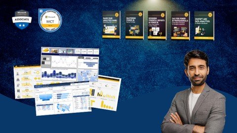
Mastering Power Bi Report Design - Beginner To Advanced

A Guide to Creating Insightful Reports, Interactive Dashboards, and Effective Data Storytelling Using Power BI
What you'll learn
Design professional-quality reports in Power BI that are both visually appealing and easy to navigate.
Create interactive dashboards that allow users to explore data and gain insights dynamically.
Explore advanced Power BI features such as bookmarks, drill-throughs, and report tooltips to enhance report interactivity.
Implement themes and templates to ensure consistency across reports and align with organizational branding.
Use Power BI's various visualization options to represent data effectively, including charts, maps, and custom visuals.
Requirements
A fundamental understanding of Power BI, including how to navigate the interface and use basic features.
Description
The "Mastering Power BI Report Design" course offers in-depth training for individuals looking to harness the full potential of Power BI for business intelligence and data visualization. The course covers a broad spectrum of topics, starting from the fundamental principles of report design and Power BI components for beginners, to advanced features such as interactive elements, custom visuals, and dynamic report enhancements. Participants will engage in hands-on exercises and real-life examples, gaining proficiency in:· Understanding and applying report design principles: Learn the philosophy behind effective report design, best practices, and common pitfalls.· Creating and formatting visuals: Explore various types of Power BI visuals, understand fields and data aggregation, and customize visuals for maximum clarity and impact.· Enhancing interactivity: Use the selection pane, bookmarks, buttons, and dynamic titles to create interactive and user-friendly reports.· Advanced visual techniques: Implement techniques such as layering, grouping, KPI cards, and chiclet slicers to add depth and personalization to your reports.· Conditional formatting and themes: Apply conditional formatting to highlight key data points and use themes to standardize the look and feel of your reports.· Dynamic calculations and titles: Learn to create dynamic calculations and titles that update based on user selections for a more interactive experience.· Tooltips and drill-throughs: Customize tooltips and set up drill-throughs to provide detailed data insights and enhance user experience.· Finalizing reports: Incorporate logos, slicers, reset buttons, and other final touches to align your reports with your organization's visual identity.By the end of this course, you will have a comprehensive understanding of Power BI report design and the skills to create impactful, visually appealing, and highly interactive reports. Join us and transform your data into powerful insights with Power BI!Our experienced trainer, Ali Noorani, will guide you through live sessions using real datasets, ensuring a structured and engaging learning flow. Alongside the live sessions, we provide a detailed manual designed as take-home material. This manual is accompanied by exercise files, allowing you to practice and reinforce your learning at your own pace. Should you need any assistance, please do not hesitate to reach out to us at. We're here to support your learning journey every step of the way.Course Outline:Module 1: Introduction to Power BI Report DesignThe philosophy behind effective report design.Best practices and common pitfalls.The importance of tailoring reports to your audience.How to create reports that inform and impress simultaneously?Module 2: Overview of the ReportDetailed walkthrough of a sample report.Understanding the purpose and audience for each report component.Introduction to various Power BI tools and features used in the report.Setting the stage for hands-on report creation.Module 3: Understanding All the VisualsIntroduction to common Power BI visuals.Scenarios for using different types of charts and graphs.Practical examples of visual selection based on data type and report goals.Tips for maximizing the effectiveness of each visual.Module 4: Understanding Fields of Visuals and Creating Donut & Column ChartsStep-by-step guide to creating and formatting donut and column charts.Understanding the fields and data aggregation in Power BI visuals.Practical tips for customizing visuals to highlight key data points.Exploring the formatting pane to enhance visual appeal.Module 5: Selection Pane, Bookmarks, and ButtonsUsing the selection pane to manage visual layers.Creating bookmarks to save specific report states.Adding buttons for interactive navigation.Practical examples of improving report interactivity.Module 6: Switching Visuals through ButtonsSetting up buttons to switch between different visuals.Managing visual visibility and state changes with bookmarks.Practical demonstration of creating a dynamic report interface.Tips for maintaining a smooth user experience.Module 7: Layering, Grouping, and KPI CardsTechniques for layering and grouping report elements.Best practices for creating a visually appealing report layout.Using KPI cards to emphasize important metrics.Practical examples of organizing report visuals.Module 8: Chiclet Slicer and Dynamic TitlesSetting up and customizing the chiclet slicer.Creating a dynamic title that updates with slicer selections.Practical examples of using images in slicers.Tips for enhancing user interaction with dynamic elements.Module 9: Adding Logos, Slicers, and Finalizing VisualsAdding and positioning logos in your reports.Setting up slicers to filter data effectively.Finalizing the visual design of your reports.Practical tips for aligning report elements with your brand.Module 10: Conditional Formatting and ThemesApplying conditional formatting to various report elements.Using themes to create a consistent visual style.Practical examples of conditionally formatting data.Tips for efficiently managing report aesthetics.Module 11: Dynamic CalculationsCreating a table to enable dynamic slicers.Writing DAX formulas for dynamic calculations.Practical examples of using dynamic calculations in reports.Ensuring seamless updates of visual data based on user selections.Module 12: Dynamic Titles and TooltipsCreating and applying dynamic titles using DAX.Setting up customized tooltips for enhanced user experience.Practical examples of integrating dynamic elements into reports.Tips for maintaining clarity and interactivity in your reports.Module 13: Reset Button, Exporting, and Importing ThemesCreating and configuring a reset button using bookmarks.Exporting and importing themes to standardize report design.Practical examples of using reset buttons and themes.Tips for ensuring a cohesive look and feel across multiple reports.Module 14: Drill ThroughsSetting up drill-through pages and connecting them to visuals.Managing drill-through filters and interactions.Practical examples of creating effective drill-through reports.Tips for training users to utilize drill-throughs effectively.
Overview
Section 1: Introduction
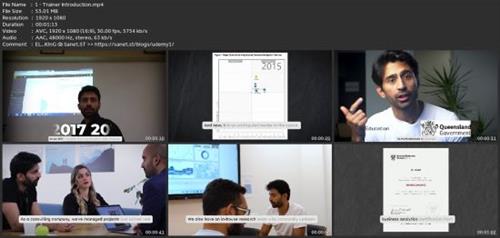
Lecture 1 Trainer Introduction
Lecture 2 Engage in Active Learning for Maximum Results
Section 2: Report Foundation and Structure
Lecture 3 Introduction
Lecture 4 Overview of the Report
Lecture 5 3 Steps to become a Data Analyst
Lecture 6 Quick Ask Syndrome
Lecture 7 Beginner's Guide to Power BI
Lecture 8 Top 10 Power BI Tricks
Section 3: Course Starter Pack
Lecture 9 Download the Course Report Template
Lecture 10 Download the Dataset
Lecture 11 Installing Power BI Desktop
Section 4: Visuals and Fields
Lecture 12 Transition into Data Analyst
Lecture 13 Understanding All the Visuals
Lecture 14 Understanding Fields of Visuals
Lecture 15 Amazon's AI Hiring Tool
Lecture 16 Power BI Visualizations Cheat Sheet
Lecture 17 Top 10 Power BI Shortcuts
Section 5: Interactivity and Navigation
Lecture 18 Top Data Experts Mindset
Lecture 19 Selection Pane, Bookmark, and Navigation
Lecture 20 Switching Visuals Through Buttons
Lecture 21 Power BI Bubble Map Tutorial: Visualizing Data with Location-Based Insights
Section 6: Advanced Design Techniques
Lecture 22 Layering, Grouping, KPI Cards
Lecture 23 Chiclet Slicer and Title
Lecture 24 Logo, Slicer, and Remaining Visuals
Lecture 25 Data-Driven Decisions How Coca-Cola Uses Weather Forecasts to Boost Efficiency
Lecture 26 Pragnancy and the Power of Data
Lecture 27 Data Transformation Cheat Sheet
Lecture 28 Supply Chain Efficiency with Power BI
Section 7: Customization and Dynamic Elements
Lecture 29 Parrot Analysis
Lecture 30 Conditional Formatting and Themes
Lecture 31 Cambridge Analytica
Lecture 32 Dynamic Calculations
Lecture 33 Disney's Magic Band
Lecture 34 Dynamic Titles, Tool Tip
Lecture 35 Reset Button, Exporting & Importing
Lecture 36 Configuring Drill through
Lecture 37 Pretty and Interesting Reports
Lecture 38 The Ultimate Power BI Tools Guide: Your Go-To Resources for Mastering Power BI
Section 8: Skill Assessment
Lecture 39 From Core Skills to Applied Mastery
Lecture 40 How do I Practice?
Lecture 41 If I have to start all over again
Lecture 42 Working Hard vs. Working Smart
Lecture 43 Power BI for Small Businesses: A Game-Changer for Data-Driven Decisions
Section 9: Take-Home Material
Lecture 44 Download the Step-by-Step Guide
Lecture 45 Exercise Files for Each Chapter
Professionals who want to enhance their report design skills in Power BI to deliver more insightful and visually compelling reports.,Individuals familiar with Excel who want to upgrade their reporting and visualization capabilities by learning Power BI.,Those working in BI who want to leverage the latest tools and techniques in Power BI to create more dynamic and interactive reports.,Independent professionals who offer data analytics and BI services and want to expand their service offerings by mastering Power BI report design.,Professionals who need to create or oversee the creation of reports that effectively communicate data insights to various stakeholders.

rapidgator.net:
ddownload.com:

Published 9/2024
MP4 | Video: h264, 1920x1080 | Audio: AAC, 44.1 KHz
Language: English | Size: 3.84 GB | Duration: 3h 36m
MP4 | Video: h264, 1920x1080 | Audio: AAC, 44.1 KHz
Language: English | Size: 3.84 GB | Duration: 3h 36m
A Guide to Creating Insightful Reports, Interactive Dashboards, and Effective Data Storytelling Using Power BI
What you'll learn
Design professional-quality reports in Power BI that are both visually appealing and easy to navigate.
Create interactive dashboards that allow users to explore data and gain insights dynamically.
Explore advanced Power BI features such as bookmarks, drill-throughs, and report tooltips to enhance report interactivity.
Implement themes and templates to ensure consistency across reports and align with organizational branding.
Use Power BI's various visualization options to represent data effectively, including charts, maps, and custom visuals.
Requirements
A fundamental understanding of Power BI, including how to navigate the interface and use basic features.
Description
The "Mastering Power BI Report Design" course offers in-depth training for individuals looking to harness the full potential of Power BI for business intelligence and data visualization. The course covers a broad spectrum of topics, starting from the fundamental principles of report design and Power BI components for beginners, to advanced features such as interactive elements, custom visuals, and dynamic report enhancements. Participants will engage in hands-on exercises and real-life examples, gaining proficiency in:· Understanding and applying report design principles: Learn the philosophy behind effective report design, best practices, and common pitfalls.· Creating and formatting visuals: Explore various types of Power BI visuals, understand fields and data aggregation, and customize visuals for maximum clarity and impact.· Enhancing interactivity: Use the selection pane, bookmarks, buttons, and dynamic titles to create interactive and user-friendly reports.· Advanced visual techniques: Implement techniques such as layering, grouping, KPI cards, and chiclet slicers to add depth and personalization to your reports.· Conditional formatting and themes: Apply conditional formatting to highlight key data points and use themes to standardize the look and feel of your reports.· Dynamic calculations and titles: Learn to create dynamic calculations and titles that update based on user selections for a more interactive experience.· Tooltips and drill-throughs: Customize tooltips and set up drill-throughs to provide detailed data insights and enhance user experience.· Finalizing reports: Incorporate logos, slicers, reset buttons, and other final touches to align your reports with your organization's visual identity.By the end of this course, you will have a comprehensive understanding of Power BI report design and the skills to create impactful, visually appealing, and highly interactive reports. Join us and transform your data into powerful insights with Power BI!Our experienced trainer, Ali Noorani, will guide you through live sessions using real datasets, ensuring a structured and engaging learning flow. Alongside the live sessions, we provide a detailed manual designed as take-home material. This manual is accompanied by exercise files, allowing you to practice and reinforce your learning at your own pace. Should you need any assistance, please do not hesitate to reach out to us at. We're here to support your learning journey every step of the way.Course Outline:Module 1: Introduction to Power BI Report DesignThe philosophy behind effective report design.Best practices and common pitfalls.The importance of tailoring reports to your audience.How to create reports that inform and impress simultaneously?Module 2: Overview of the ReportDetailed walkthrough of a sample report.Understanding the purpose and audience for each report component.Introduction to various Power BI tools and features used in the report.Setting the stage for hands-on report creation.Module 3: Understanding All the VisualsIntroduction to common Power BI visuals.Scenarios for using different types of charts and graphs.Practical examples of visual selection based on data type and report goals.Tips for maximizing the effectiveness of each visual.Module 4: Understanding Fields of Visuals and Creating Donut & Column ChartsStep-by-step guide to creating and formatting donut and column charts.Understanding the fields and data aggregation in Power BI visuals.Practical tips for customizing visuals to highlight key data points.Exploring the formatting pane to enhance visual appeal.Module 5: Selection Pane, Bookmarks, and ButtonsUsing the selection pane to manage visual layers.Creating bookmarks to save specific report states.Adding buttons for interactive navigation.Practical examples of improving report interactivity.Module 6: Switching Visuals through ButtonsSetting up buttons to switch between different visuals.Managing visual visibility and state changes with bookmarks.Practical demonstration of creating a dynamic report interface.Tips for maintaining a smooth user experience.Module 7: Layering, Grouping, and KPI CardsTechniques for layering and grouping report elements.Best practices for creating a visually appealing report layout.Using KPI cards to emphasize important metrics.Practical examples of organizing report visuals.Module 8: Chiclet Slicer and Dynamic TitlesSetting up and customizing the chiclet slicer.Creating a dynamic title that updates with slicer selections.Practical examples of using images in slicers.Tips for enhancing user interaction with dynamic elements.Module 9: Adding Logos, Slicers, and Finalizing VisualsAdding and positioning logos in your reports.Setting up slicers to filter data effectively.Finalizing the visual design of your reports.Practical tips for aligning report elements with your brand.Module 10: Conditional Formatting and ThemesApplying conditional formatting to various report elements.Using themes to create a consistent visual style.Practical examples of conditionally formatting data.Tips for efficiently managing report aesthetics.Module 11: Dynamic CalculationsCreating a table to enable dynamic slicers.Writing DAX formulas for dynamic calculations.Practical examples of using dynamic calculations in reports.Ensuring seamless updates of visual data based on user selections.Module 12: Dynamic Titles and TooltipsCreating and applying dynamic titles using DAX.Setting up customized tooltips for enhanced user experience.Practical examples of integrating dynamic elements into reports.Tips for maintaining clarity and interactivity in your reports.Module 13: Reset Button, Exporting, and Importing ThemesCreating and configuring a reset button using bookmarks.Exporting and importing themes to standardize report design.Practical examples of using reset buttons and themes.Tips for ensuring a cohesive look and feel across multiple reports.Module 14: Drill ThroughsSetting up drill-through pages and connecting them to visuals.Managing drill-through filters and interactions.Practical examples of creating effective drill-through reports.Tips for training users to utilize drill-throughs effectively.
Overview
Section 1: Introduction
Lecture 1 Trainer Introduction
Lecture 2 Engage in Active Learning for Maximum Results
Section 2: Report Foundation and Structure
Lecture 3 Introduction
Lecture 4 Overview of the Report
Lecture 5 3 Steps to become a Data Analyst
Lecture 6 Quick Ask Syndrome
Lecture 7 Beginner's Guide to Power BI
Lecture 8 Top 10 Power BI Tricks
Section 3: Course Starter Pack
Lecture 9 Download the Course Report Template
Lecture 10 Download the Dataset
Lecture 11 Installing Power BI Desktop
Section 4: Visuals and Fields
Lecture 12 Transition into Data Analyst
Lecture 13 Understanding All the Visuals
Lecture 14 Understanding Fields of Visuals
Lecture 15 Amazon's AI Hiring Tool
Lecture 16 Power BI Visualizations Cheat Sheet
Lecture 17 Top 10 Power BI Shortcuts
Section 5: Interactivity and Navigation
Lecture 18 Top Data Experts Mindset
Lecture 19 Selection Pane, Bookmark, and Navigation
Lecture 20 Switching Visuals Through Buttons
Lecture 21 Power BI Bubble Map Tutorial: Visualizing Data with Location-Based Insights
Section 6: Advanced Design Techniques
Lecture 22 Layering, Grouping, KPI Cards
Lecture 23 Chiclet Slicer and Title
Lecture 24 Logo, Slicer, and Remaining Visuals
Lecture 25 Data-Driven Decisions How Coca-Cola Uses Weather Forecasts to Boost Efficiency
Lecture 26 Pragnancy and the Power of Data
Lecture 27 Data Transformation Cheat Sheet
Lecture 28 Supply Chain Efficiency with Power BI
Section 7: Customization and Dynamic Elements
Lecture 29 Parrot Analysis
Lecture 30 Conditional Formatting and Themes
Lecture 31 Cambridge Analytica
Lecture 32 Dynamic Calculations
Lecture 33 Disney's Magic Band
Lecture 34 Dynamic Titles, Tool Tip
Lecture 35 Reset Button, Exporting & Importing
Lecture 36 Configuring Drill through
Lecture 37 Pretty and Interesting Reports
Lecture 38 The Ultimate Power BI Tools Guide: Your Go-To Resources for Mastering Power BI
Section 8: Skill Assessment
Lecture 39 From Core Skills to Applied Mastery
Lecture 40 How do I Practice?
Lecture 41 If I have to start all over again
Lecture 42 Working Hard vs. Working Smart
Lecture 43 Power BI for Small Businesses: A Game-Changer for Data-Driven Decisions
Section 9: Take-Home Material
Lecture 44 Download the Step-by-Step Guide
Lecture 45 Exercise Files for Each Chapter
Professionals who want to enhance their report design skills in Power BI to deliver more insightful and visually compelling reports.,Individuals familiar with Excel who want to upgrade their reporting and visualization capabilities by learning Power BI.,Those working in BI who want to leverage the latest tools and techniques in Power BI to create more dynamic and interactive reports.,Independent professionals who offer data analytics and BI services and want to expand their service offerings by mastering Power BI report design.,Professionals who need to create or oversee the creation of reports that effectively communicate data insights to various stakeholders.
Screenshots

rapidgator.net:
You must reply in thread to view hidden text.
ddownload.com:
You must reply in thread to view hidden text.
